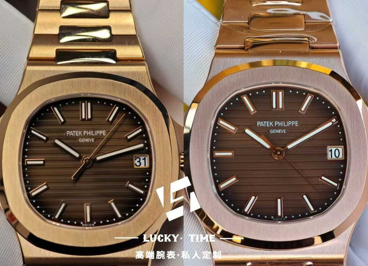
| Feature | SW (Left) | DDF (Right) |
|---|---|---|
| 1. Dial color | Better gradient, black edge treatment more accurate | Too reddish, shows an extra copper/red tone |
| 2. Dial printing | Warm white, thicker font | Whiter, thinner font |
| 3. Hour markers | Inner side has a curved finish, smooth transition | Rough finish, not perfect |
| 4. Marker lume fill | Correct green color | Too white |
| 5. Hands | Solid center axle, correct | Slightly oversized |
| 6. Hand lume fill | Correct color | Too white |
| 7. Date wheel | Larger, wider font | Slightly smaller font |
The SW dial on the left is closer to the genuine in overall color, gradient, and black edge treatment. The lume color is correct (green), the hand center axle is solid and properly sized, and the date font is fuller. The DDF dial on the right leans too red with a coppery tone, the lume is too white, the hour markers are rough, and the hands are slightly oversized.
Simply put: SW has higher authenticity; DDF still falls short on some details. If you’re after the closest visual match to the genuine, SW is the better choice. DDF might be cheaper, but for detail‑oriented collectors, SW is the way to go.